- Why button color is a late-stage test
- Fix the offer before you touch the layout
- Message match from the traffic source to the page
- Friction: fields, delay, and an unclear next step
- Proof and risk, not decoration
- What should already be fixed before anyone runs tests
- Site-wide conversion design versus one landing page
- A practical sequence for one URL
- FAQs
For Agency Owners · Intermediate · Commercial · Solves: Running A/B tests on a vague offer, Paid traffic bouncing on message mismatch, Forms that ask for too much too soon
Key takeaways
- Button color is a late test. Offer, message match, and friction come first.
- Write a forwardable offer sentence before you open the design file.
- The page must continue the conversation from the ad, email, or query that earned the click.
- Cut form fields to what you use, confirm events fire, then build an experiment backlog.
Landing page conversion optimization does not start with button color. It starts with whether the page has an offer a human can understand, a message that matches why they clicked, and a path that does not punish them for trying to say yes.
Color tests are cheap theater when the headline is vague, the form is a questionnaire, and the traffic source promised something the page never repeats. I will run experiments. I will not run them first. First we make the page honest.
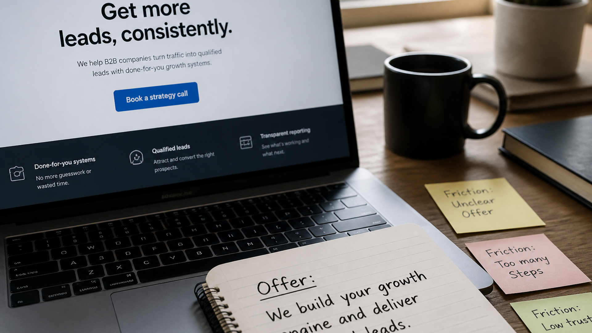
Most landing pages I inherit already have a design system, a brand color, and a button that is plenty visible. What they lack is a deal. The visitor cannot repeat what they get. The form feels like an application to speak to sales. The page talks about the company instead of the job the ad mentioned. Optimization in that state is rearranging furniture in the wrong house.
This is the landing-page version of that sequence: offer, message match, friction, proof. It is not a site-wide CRO program, and it is not a gallery of SaaS layout patterns. Those are useful later. They are the wrong first conversation.
Why button color is a late-stage test
A color change can only help if the visitor already understands the deal and can complete the action. If they do not know what they get, contrast on the button is not the constraint. If they have to hunt for pricing logic, the button is not the constraint. If the form asks for a budget range before it earns trust, the button is not the constraint.
Tests also need volume. A landing page with a handful of conversions a week cannot detect a small lift. You will stare at inconclusive charts and call it optimization. Qualitative work is the adult move: recordings, the sales team's objection list, and a headline you can read out loud without cringing.
If you cannot explain the offer in one sentence, you are not ready to A/B test the sentence's background color.
Fix the offer before you touch the layout
The offer is the exchange: what they get, what it costs in money or time, and what happens after the click. 'Learn more' is not an offer. 'Get a demo' is barely an offer if the demo is a 45-minute pitch with no agenda. 'Start free' is an offer only if the page says what free includes.
Write the offer as a sentence the visitor could forward. Put it in the hero. Repeat it near the form. If marketing, ads, and sales cannot use the same sentence, the page will leak. Layout cannot save a disagreement about the product. When those three teams argue in a comment thread, the landing page is usually the transcript of the argument. Resolve the argument in a doc, then put the winner on the page.
- Name the buyer and the job in the headline.
- Name the deliverable: trial, audit, call, download, waitlist.
- Name the next step after they convert, in plain language.
- Name who it is not for, if that stops junk leads you cannot serve.
I do this on paper or in a doc, not in Figma. If the sentence is weak, a new section order will still be weak. If the sentence is strong, a simple page can convert while you wait for design.
Message match from the traffic source to the page
The page has to continue the conversation that started the click. If the ad promised a migration audit, the hero cannot talk about brand identity. If the email promised a pricing calculator, the page cannot hide packaging behind a webinar. Mismatch is one of the fastest ways to burn paid traffic.
Check the actual entry points: ads, emails, partner mentions, sales sequences. For each campaign, the landing URL should reuse the language of the click. Not keyword stuffing. Continuity. The visitor should feel they arrived in the right room.
- Headline echoes the query or the ad promise.
- The first screen does not introduce a second product.
- UTMs land on a URL built for that campaign, not a generic homepage.
- If you run multiple offers, you have multiple URLs. Do not rotate offers in one hero.
Crawlable, unique URLs still matter when you multiply campaign pages. Keep canonicals honest. Google's duplicate URL guidance is how you avoid 15 parameter copies of the same form.
Friction: fields, delay, and an unclear next step
Friction is anything that makes saying yes more expensive than it should be. Extra fields. Forced account creation. A calendar that only shows after a thank-you email. Tiny tap targets. A page that takes seconds to become interactive because the hero is a video wall. If they have to guess what happens after submit, they will not submit. Tell them: who replies, how fast, and what the first call is for.
I cut fields until someone can name why each one is used for routing. Name, work email, and one qualifier is a default. If you need company size, say why. If you do not use the answer, delete the question. Sales can ask it on the call.
Performance is conversion
A slow landing page is a form people never see. LCP on a campaign URL is not a vanity lab score. It is whether the offer appears before the visitor bounces. Compress the hero. Kill the extra fonts. Do not load the whole marketing site's tag soup on a paid URL.
Treat LCP and the rest of Core Web Vitals as part of CRO, not a separate 'tech' ticket you will get to later.
Proof and risk, not decoration
Proof answers 'why should I believe you.' Risk reversal answers 'what if this is a waste of time.' On a landing page, both belong near the action. A testimonial in the footer does not help the person hovering on submit.
Use real quotes, named roles, and public work you can point at. Do not invent conversion lifts. Do not borrow logos you cannot defend. If you are early, show the product doing the job, a clear process, or a specific guarantee about the call (agenda, length, who is on it).
Objections should be on the page. Price, timing, fit, implementation, 'is this for companies like us.' FAQ that matches what sales actually hears is conversion copy. FAQ that matches a keyword tool is padding.
What should already be fixed before anyone runs tests
If you hire help, they should refuse to test on a broken baseline: no analytics, no offer sentence, no message match, a form that does not fire an event. Experiments on garbage still produce charts.
The program-level version of that filter is what a CRO agency should fix before it starts testing. This article is the single-URL version you can run this week.
Once tracking is real and the offer is clear, test things that change the decision: offer framing, proof type, form length, pricing presentation, and which objection you answer first. Color and microcopy are later, when you have enough conversions to see a small effect.
Site-wide conversion design versus one landing page
A landing page has one campaign job. A marketing site has many. Do not strip the whole website down to a form, and do not load a full mega-nav onto a paid landing URL. They are different templates with different jobs.
For money pages on the main site, use conversion-focused structure for pipeline pages. For SaaS campaign URLs once the offer is already clear, use the landing layout patterns for a single product job.
A practical sequence for one URL
- Write the offer sentence and the post-click promise.
- Match the hero to the traffic source. If they do not match, stop and split URLs.
- Put one primary action on the page. Same label in hero and near the form.
- Place one proof object next to the action.
- Cut form fields to what you use. Confirm the event fires.
- Check mobile and LCP on the real campaign URL.
- Only then write an experiment backlog.
Above the fold is a hierarchy, not a mood. Headline, supporting line, primary action, and one proof cue. If the first screen is a device mock, a gradient, and a vague claim, you already lost people who arrived with a specific intent. You can keep the mock. It cannot outrank the sentence.
Secondary actions belong in a lower visual weight. 'Watch a video' next to 'Book a call' as equal buttons splits the room. Pick the commercial action. The video can sit under the fold for people who need it. Equal CTAs feel balanced in a design review and messy in a funnel.
Do the qualitative pass in the same week. Watch ten session recordings. Read ten sales notes from the campaign. You will usually find the same three objections and the same two points where people stall. Put those on the page. That will move the needle more than a 49 versus 51 percent color split you cannot statistically see.
Tracking is part of the offer being honest. If 'conversion' in the ad account is a form start, a thank-you page view, and a CRM create, you will optimize the wrong thing. Pick one event that means a human asked for the thing you sell. Fix that event. Then optimize the page that is supposed to produce it.
That sequence is the work. Button color is a footnote you earn. If you want a landing URL reviewed before you spend another month on variants, send the page and the ad or email that points at it. I will tell you whether the offer is the problem.
Implementation table
| Fix | Problem | What to change | Metric | Tool |
|---|---|---|---|---|
| Offer sentence in the hero | Vague headline and 'learn more' | Write buyer, deliverable, and post-click promise in one sentence | Time to first form interaction | Recordings + analytics |
| Campaign URL match | Ads to a generic page | Hero language matches the ad or email promise | Bounce on paid landings | Ads + analytics |
| Form trim and event | Long form, missing conversion event | Keep routing fields only; fire a real submit event | Form completion rate | Form analytics |
Send the landing URL and the click that feeds it.
I will tell you whether the offer, the match, or the form is the constraint before you spend another month on button variants.
Book a landing page reviewSources & references